#layer-spotlight-1270
Spotlighting works in the collection
Take a deep dive into a work of art with delightful curator Dr. Catherine Walworth, and through her eyes you’ll find yourself falling in love with art over and over again.
#layer-duo-2192
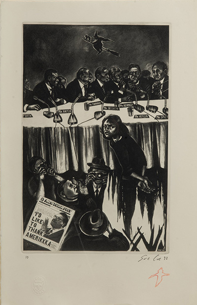
Sue Coe
(British and American, b. 1952)
Anita Hill (Thank You America)
1992
Etching on paper
Gift of Porter-Price Collection
Today we spotlight another new acquisition, and a timely one. Thirty years ago this week, Dr. Anita Hill testified before a Senate Judiciary Committee during the Supreme Court confirmation hearings of Clarence Thomas. In this etching by the take-no-prisoners artist Sue Coe, Hill turns around to confront the viewer. Hers is the only outward gaze in the entire scene, and it’s even more remarkable because she is also currently being burned as a witch. Her crime was coming forward at a time when sexual harassment was barely recognized as a phrase, let alone an issue. The flames licking at her dress and body mimic the folds in the cloth on the senators’ long table. Members of the press surround her with their cameras. The composition is compressed, jagged, and claustrophobic. Something about that felt eerily familiar.
I began my freshman year of college in 1991, just one month before the testimony took place. I was studying Renaissance Art, and a year or two later I would learn about Artemisia Gentileschi, who was just then being rediscovered and celebrated. An Italian Baroque painter, she was raped by the artist Agostino Tassi, who had ties to the Pope, and she testified to the events in a papal court. Like Hill, Gentileschi was disparaged as unstable by Tassi, but she repeated her claims to his face and even underwent torture to prove she was telling the truth.
Gentileschi’s version of Susanna and the Elders pushes Susanna up against a stone bench, much as Coe does with the senators’ table, and her neck similarly cranks away from the men as they whisper about her. Gentileschi’s female perspective on the scene, in which Susanna is spied upon and ogled in her bath, also became fodder for dissection in my Feminist Art class in college, so Coe had to know it. Or did (art) history just repeat itself?
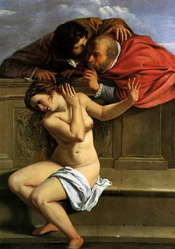
Artemisia Gentileschi (Italian, 1593 – c. 1656)
Susanna and the Elders, c. 1610
Oil on canvas
Schloss Weißenstein Collection
#layer-duo-2191
Gronk
(b. Glugio Nicondro) (b. 1954)
Life’s a Tassel
1988
Acrylic on canvas
Gift of Porter-Price Collection
Today we spend time with a new museum acquisition that went into our storage vault less than a year ago. Created by Los Angeles-based Chicano artist Gronk, Life’s a Tassel (1988) works all my membranes. While its color palette and jagged Expressionist style might seem severe and offputtingly moody at first, every time I look at the painting it becomes more of a welcomingly humorous gift of a riddle. The subject is La Tormenta, the recurring character that entered Gronk’s absurdist paintings in the 1980s. Always seen from the back, she operates almost like a figure in a Greek chorus who witnesses events.
In our painting, she appears to be performing for an audience. Yet, when viewing the painting in person, those soft glowing shapes that might be the heads of seat fillers actually appear more celestial, as if she’s staring at an impossible night sky from a porch balcony. Meanwhile, a fried egg flies by like a shooting star. It’s either a comment on her singing or a big cosmic breakfast dish in the sky. Whatever her situation, surrounded by frenetic brushstrokes, La Tormenta can lean on the giant velvety-soft tassel of the painting’s title for support, and it does really seem to have her back.
#layer-duo-2006
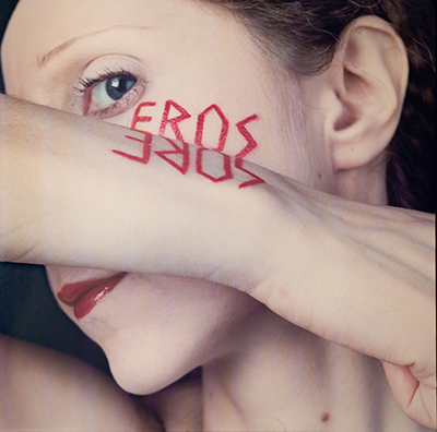
Rimma Gerlovina and Valeriy Gerlovin
Americans, b. Russia, 1951 and 1945
Eros
1989
Color photograph
Gift of Dr. Richard W. Levy
I’ve kept one side eye on this photograph in storage for a few years now. It’s both fiercely passionate and, frankly, completely terrifying. The red script written in lipstick on the woman’s face reads "EROS" for the Greek god of love. Rather than a true reflection on her arm, however, it spells out "SORE" in reverse. The artists’ descriptive note is "pleasure/pain principle," and at the core of their work is an electrically charged polarity of opposites.
This oppositional image is perfect in our current moment for two reasons. First because, as vaccinations rise, we are in a pandemic and not in a pandemic. Second, because Gerlovina and Gerlovin were important Moscow Conceptualists, artists forced to make unofficial artwork in secret in the 1970s. They were friends and associates of the artists in our upcoming summer exhibition The Ironic Curtain: Art from the Soviet Underground. After a 1977 performance Zoo, in which the two artists sat naked and caged to symbolize the Soviet regime’s repression of Russian culture, the pair faced difficulties with authorities and emigrated to the United States in 1979. Talk about opposites! That was a major Cold War flip.
#layer-duo-1943
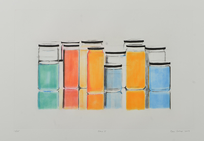
Peri Schwartz
Jars I
2017
Spit bite etching with drypoint and sugar lift
Gift of the artist
This arrangement of colorful, liquid-filled jars is by Peri Schwartz, an artist who passed away earlier this month. We have not even shown our two works by Schwartz yet, gifts from the artist herself in 2018. Let’s discuss and send her off with love.
These jars are packed in tight — expectant passengers on a rain-soaked platform waiting for a train to arrive. Schwartz thought about Giorgio Morandi’s sweet little still lifes and how each of his bottles had personality. This crisp etching is different from Morandi’s paintings, but the same joy lives in her inanimate objects.
Ultimately, Schwartz made art about making art. Her subject was her New Rochelle studio with its windows and tall stools and stacks of books. She always examined her room through the lens of a trusty grid, that old modernist windowpane. She knew what she couldn’t move and had fun adjusting what she could in that space. Sometimes she made self-portraits there. She loved color, and these light-filled jars are practically laser beams. She taught her students the graceful art of slowing down.
Let’s all be like Peri Schwartz today and be particularly mindful, look at your surroundings like a stranger, and remember the fun.
#layer-duo-1844
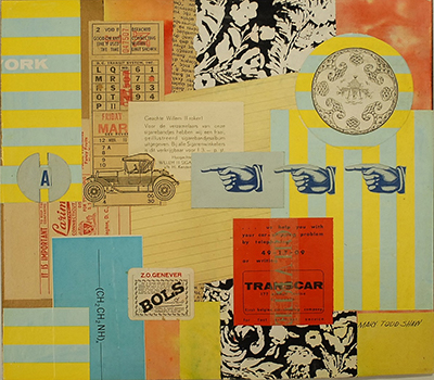
Mary Todd Shaw
(1921–2013)
Patterns
c. 1966
Collage
Gift of Mary Todd Shaw
Look at this little ditty from the 1960s! So bright and busy. It is almost audible in its energy, as though horns are honking to alert floating paper shapes not to knock into each other. I’ve been halted by this work several times, and it’s time for it to come out and play.
You may not have heard of Mary Todd Shaw, and here’s why that’s a shame. She was gutsy. Despite a profound hearing loss as a child, she not only persisted, but became what sounds like a really funny and fearless pioneer. After high school she became a commercial artist, and as part of the Manpower Act under the U.S. Chemical Warfare Service, Shaw was one of the first women to attend Georgia Tech, where she learned drafting. She designed gas masks and flamethrowers (hello!) for the War Department during World War II. Finally, when she was in her 50s, Shaw had the temerity to go back to art school and travel the world, and by all accounts she had a streak of absurdity that I admire.
It's fitting that we have a collage, because she loved assemblage. And when you know all that you now know about Mary Todd Shaw, you can see it in this work. There are chemical elements, automobiles, wayfinding symbols, District of Columbia transit tickets, foreign languages, bold colors, and shapes dancing with each other. This jitterbug of joy will be on view in our Focus Gallery show Assembly Required: Collage from the CMA Collection starting April 1.
#layer-duo-1846
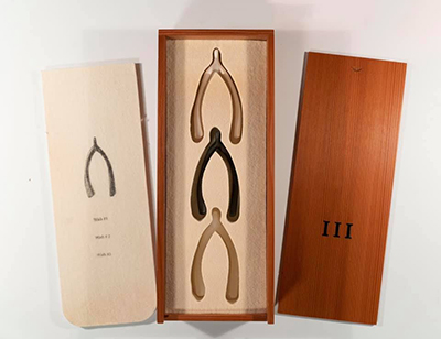
Lorna Simpson
(American, b. 1960)
III
1994
Edition of 5000
Wood, felt, ceramic, rubber, bronze
Gift of the Peter Norton Family
Lorna Simpson is a conceptual photographer whose black-and-white images meditate on issues of race and gender. Rather than documentary scenes, she offers clues, symbols, and snippets of text that require time and thought, like Buddhist koans. This is the second time I’ve featured Simpson in this series (see Cure/Heal), but I get to share a different side of her art this time with these delightful little sculptures in their own felt-lined treasure box.
I like that this box contains wishes. The artist created the work in 1994 for Peter Norton’s Family Christmas Project, which dispersed limited edition works of art to friends and art institutions each year for the holiday. In 1993, Simpson had made a different work on the same theme — that time, it included two clear glass wishbones, a photo of a broken glass wishbone, and an etching on glass that read, ‘Clearly if you got what you wished you know you’d end up wanting another wish.’
In our slightly later work, all the wishing tools (the magical number three) are physically present, nestled in felt but ready to emerge when needed. Each in turn is made of hard bronze, bouncy silicone rubber, and delicate, unglazed ceramic. They have different levels of fragility, like the Three Little Pigs’ houses built in straw, stick, and brick — each with the wolf at the door.
If Cure/Heal allowed me to reflect on the early days of the pandemic, this work lets me hold out hope for the new year. I’m glad that this time the wishbones are all intact. These wishes are pure potential, and one at least — the bronze one — is meant to stay that way.
#layer-duo-1802
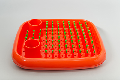
Marc Newson
designer (b. 1963)
Magis, S.p.A. (manufacturer, Italian, founded 1962)
Dish Doctor
designed 1997, manufactured 1998
Injection-molded polypropylene
Gift of Mel Byars
This object is cheerfully eye-popping enough to stop someone in their tracks, whether they be scrolling on their phone or strolling through museum galleries. One might also become a little indignant at realizing this beautiful sculpture — perhaps an example of Latin American kinetic or Op art? — is a humble dish drainer.
Its designer, Australian-born Marc Newson, is a superstar in the contemporary design world, best known for his sleek, riveted aluminum Lockheed Lounge that Madonna reclined on in a 1993 music video. It set the record for the most expensive design object by a living designer more than once in the 2010s.
This is a dish drainer though. It literally holds dishes and silverware upright so they can air dry. If you own one, you probably live alone or don’t own a dishwasher. (At my house, running the dishwasher means I must be out for a jog.) But it also means you have flair. You are interested in the legacy of Italian plastic design goods, including 1960s Kartell furniture, examples of which are on view in our galleries right now. You appreciate bold, contrasting colors as a mood elevator. You want a little more fun in your life and recognize good functional design. This drainer snaps apart to release water, feels great in the hand, and won’t scratch a dish. Dish Doctor is particularly relevant, too, as 2020 saw us eating at home so much more, living and working there with our own belongings as constant companions. Dish Doctor is a prescription reminder to do our work joyfully.
#layer-duo-1671
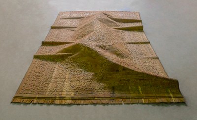
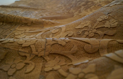
Sudarshan Shetty
Born 1961, Mangalore, India
Untitled
2015
Wood
On Loan from Pizzuti Collection
Image courtesy GALLERYSKE
As we broaden the focus of Walworth Wednesday beyond just art in storage, I was asked to choose a work from Visions from India. Frankly, I could have closed my eyes, spun around, and pointed at anything, and I’d be over the moon. There are six galleries filled with big, bold, smart, surprising contemporary art.
I laid out the galleries with elective affinities in mind rather than strict themes, and originally this carved wooden rug was in a gallery that speaks to both urbanization and geopolitical ideas, including physical areas of contention like Kashmir. I thought the mysterious rise in the rug, which resembles a mountain range but also suggests a body, had something strange and quiet to add to that conversation.
Its crate, however, is too wide for the regular doorways, and in the gallery where it was resting I had what I call my ‘lyrical moment.’ This gallery has works that are more languorous — meandering lines, pink threads, female deities, floating books. As I peered down into the crate I thought, it’s already home. This ornately carved rug from reclaimed teak looks scarily delicate, but the work required several people to lift. I like the duality of heavy and light, beautiful and threatening. The object with scrolling leaves and flowers transformed in response to its new surroundings. How exciting is that?
#layer-spotlight-1621
September 23, 2020
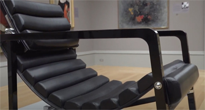
Eileen Gray
(Designer)
American, 1855–1919
Ecart International (Manufacturer)
French, 1978–present
Transat Chair
designed 1927–1930; manufactured, c. 1985
Enameled wood, chromed steel, leather
Museum purchase with funds provided by the Columbia Design League
CMA 2020.2
Please enjoy this special edition Walworth Wednesday in which your intrepid curator Dr. Catherine Walworth showcases an awesome new acquisition (thanks, Columbia Design League!), Eileen Gray's Transat Chair! Check it out in person in Collection Gallery 8, and hear more about it from the comfort of your own chair/couch/cushion on October 4 during CDL presents Please Have a Seat: A Conversation on Eileen Gray.
#layer-duo-1598
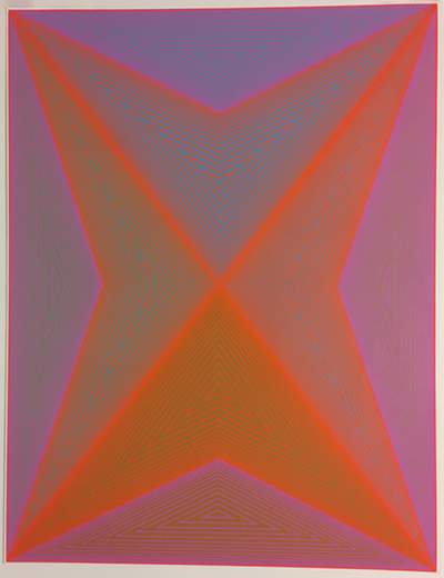
Richard Anuszkiewic
(American, 1930–2020)
God Is Not a Mathematical Diagram, from “The Inward Eye” Portfolio
1970
Screenprint in colors
Gift of Ross Smith
If you thought vibratingly fun Op Art had only superficial surface value, then hold on to your saddle — this one goes deep. Richard Anuszkiewicz’s ‘God Is Not a Mathematical Diagram’ takes its name from 18th-century Romantic poet and artist William Blake, for whom ‘mathematical diagram’ meant the measurable world. It was his disparaging way to describe the concrete "vegetable universe" as opposed to the infinitely lovely Divine imagination.
This screenprint is a valentine from one artist to another. It comes from Anuszkiewicz’s ‘Inward Eye’ portfolio of 10 prints, each with an individual envelope featuring a Blake text. Anuszkiewicz studied art at Yale during famous colorist Josef Albers’ tenure, and yet he was painting human figures in the old-fashioned Ashcan School style. Inspired by Albers, he threw that off for a world of colorful, non-bodily abstraction. Yet his colors mixed in the very real physical eye of the viewer in order to work their magic.
On the inside of this print’s envelope, the text highlights Urizen, Blake’s ironic version of a muscular God with flowing beard who uses a drawing compass to map out (but also severely limit) his physical world. On the contrary, Blake saw an infinite, immeasurable intelligence in everything and in everyone, so Anuszkiewicz’s flickering abstract images might be read as a beautiful, expansive inner power.
Rest in divinely colorful peace, Richard Anuszkiewicz.
#layer-duo-1583
Robert Rauschenberg
(American, 1925-2008)
Cross-Ties (Tracks)
1976
Dirt and resin binder with fiberglass reinforcement and wet soil patina
Gift of W. Dean Gillette
This piece is wonderfully silly and feels like summer. It reminds me of playing with dirt, racing, and living in the moment. Robert Rauschenberg made six different variations of these pieces in 1976 — automobile tires had appeared in his work for decades, so by this time he’s basically referencing himself. Think of his famous ‘combine’ sculpture Monogram from the late 1950s, a taxidermied goat whose face was painted and waist encircled by a tire. It was an aggressively weird statement about real life entering into art, and a wrestling match between painting, sculpture, and so many other things.
I prefer, though, the time in 1953 that Rauschenberg asked his friend John Cage to drive his Ford Model A through a pool of black paint and over 22 feet of paper glued together. The resulting piece belongs to the San Francisco Museum of Modern Art and is strangely beautiful. John Cage was a composer, but for artists at the time, he was also a teacher about ideas like letting go in favor of chance. By having Zen Buddhism-loving Cage drive over the paper, Rauschenberg was removing his own hand and using Cage as a different kind of loaded medium.
This brings us to the Tracks series. By the 1970s, Rauschenberg had moved from gritty New York to sunny Captiva, Florida, and he partnered with local ceramicist Alan Eaker to work out this idea. First, Rauschenberg ran a tire over clay slabs and then cut the slabs out and pressed them with his thumbs — you can see where he pushed together the ‘smile’ and ‘frown’ of our Cross-Ties. Eaker made molds from each of the clay pieces and then cast dirt and resin in the molds and added fiberglass at the back for strength. Only 18 of these were produced, so how lucky are we?
#layer-duo-1568
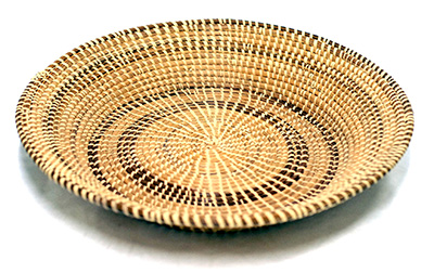
Mary Jane Bennett
(American)
Rice Fanner
c. 1982
Sweetgrass, bulrush, palmetto fronds, pine needles
Museum purchase
This beautiful, functional object is a rice fanner, used to separate rice from the husk. To me, it’s also a work of abstract sculpture. If you fix your eyes on the center, the result of its coils and bindings is a dynamic pulse that radiates outward in quick bursts. Its maker, Mary Jane Bennett, described the use of darker pine needle as a specific aesthetic choice meant to contrast with the lighter sweetgrass, and she compared it to a two-tone shoe. I love the thought of an oxford saddle shoe as visual push-pull.
When we think of process, Bennett knew the full value of her labor and that it stretched back to the very gathering of materials. She could drive over an hour and then walk three or four miles to gather just an armload of precious sweetgrass. A snake might slither over her foot as she pulled the plants, and if she got stung by bees, the shot at the doctor’s was often more expensive than the value of the sweetgrass gathered.
She also described her family’s basket sewing skills as the result of their combined cultural traditions, reportedly West African and Native American. After generations of learning, each new basket maker set themselves design challenges — making a breadbox or a cake plate-shaped basket — and having the expertise to adapt their forms without a template, they achieved whatever they imagined.
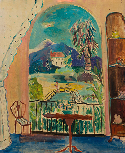
#layer-duo-1484
Hazel Guggenheim McKinley
(American, 1903–1995)
The Open Window
no date
Oil on canvas
Gift of the artist
When I first saw this painting high up on the storage rack, I did a quick double take and wondered if we had a Matisse nonchalantly hanging around storage. This is just his kind of view out a window in the south of France, past a delicate and slightly akimbo chair, table, and bowl of flowers. The vibrating lines and busily built patches of color are influenced by Matisse, but also probably by Raoul Dufy, who I happen to enjoy even more.
But while the scene wants to be sunny and filled with Mediterranean light, the painting is surprisingly muted in person — an earthy brown overshadowing the airy blue. The hand that made it was Hazel Guggenheim’s (such a fun name.) She was the younger sister of art maven Peggy Guggenheim and niece of museum founder Solomon R. Guggenheim.
Hazel was a tragic bohemian adventurer. Not only did her father go down on the Titanic in 1912, but her first two children mysteriously fell to their deaths from a Manhattan rooftop in 1928 while she watched. This led to her being effectively cast out of New York society. She had already been living in Paris for most of the 1920s, so she remained there and continued to study modern art, later becoming close with the London Group in the 1930s. Hazel married and divorced several times and eventually lived out her last decades in New Orleans, long enough to be considered one of that city’s local artists.
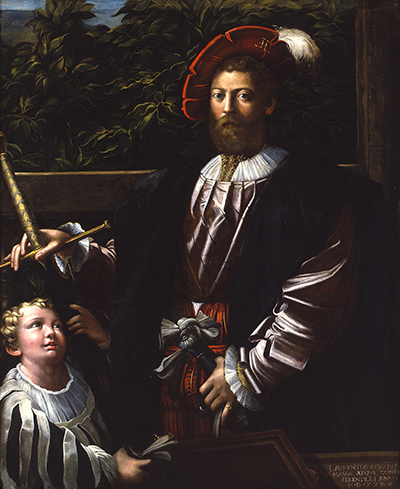
#layer-duo-1467
Parmigianino
Italian (Emilian School), 1503–1544
Lorenzo Cybo, Captain of the Papal Guard
c. 1524–26
Oil on canvas
This week I was writing, fully inspired by the muses, and then my laptop crashed. Dead. I had to sit down with paper and pen and re-create from memory what I had written. No longer fun, it was a race against forgetting and a weak copy.
With that in mind, I chose a work, rotated off view a few years ago, that is also a copy— the original lives in the National Gallery of Denmark. Art historian Giorgio Vasari, whose life overlapped with the famous artist Parmigianino’s, wrote: ‘As a result of his fame, Lorenzo Cybo, the captain of the Swiss guard and a very handsome man, chose to have his portrait painted by [Parmigianino]; one might say that the artist did not so much portray him as create him of flesh and blood.’
Now I’m not going to say unkind things about our beloved version, but it does feel a tad wooden by comparison. Even the young page boy makes me feel slightly awkward. Maybe that’s because more sparkly magic went into conceiving the original and then doing it over felt more like labor. This may also be why experts haven’t been able to agree if our version is by Parmigianino or a slightly later copyist.
But enough about that mystery. Let’s talk fashion. The slashed clothing throughout this painting registers as just punk enough to tickle me, so I looked into it. It turns out that while this was the height of fashion in the 16th century, the Papal Guard were the ones who allegedly started the trend. After defeating Charles the Bold in 1476, Swiss army troops marched through Burgundy. Their clothes were in tatters, so they cut up tents, banners, and the nice fabrics of noblemen in villages along the way home and stuck these bright new fabrics through the holes in their clothing. People saw it and copied the look, sewing a differently colored fabric underneath slashed fabric. The style spread across Europe for the next century.
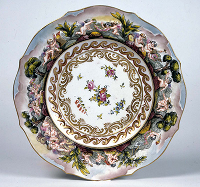
#layer-duo-1452
Capodimonte, manufacturer
(Italian, Naples, active 1771–1821)
Dinner plate
c. 1800
Porcelain
Gift of Mrs. Foster Milliken
This is one of 28 matching dinner plates in the CMA collection, though I can’t imagine ever putting food on it. There just isn’t room for anything else — maybe some translucent Jell-O that would amplify the decoration, turning it into a full-tilt rave situation rather than hiding it.
With rosy clouds behind them, little Italian putti, or winged children, frolic and chase each other in such a way that the plate wants to continually spin in your vision, helped along by the ancient graphic pattern for water rolling by and ringing a group of flowers falling in space. What part of this plate isn’t moving? The outer edge is positively cinematic.
Porcelain doesn’t get much respect these days, but at the time of this plate’s making, it was huge. I often compare the 18th-century European competition to unlock the mysteries of China’s porcelain recipe as the equivalent of the Space Race between the USSR and United States in the 1950s. There was massive political domination in being able to show you had that particular science. But with porcelain, you could even serve your diplomatic guests dinner on it to really stage political theater.
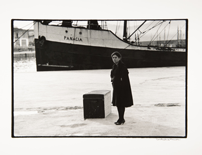
#layer-duo-1433
Constantine Manos
(American, b. 1934)
Woman in Mourning Awaiting Steamer, Heraklion, Crete
c. 1961
From the series "A Greek Portfolio"
Gelatin silver print
Gift of the artist
Ooph. This one hits you right away. Those heavy black and whites, the angles, and the way the steamer trunk’s sides turn bleached white and match the two-tone ship. The woman in mourning stands in a blast of white ground, her face stealing and sending back all the energy.
Behind all this is the ship Panacia, the thing that makes me love this photo so terribly much. The ancient Greek goddess Panakeia possessed a cure-all medicinal potion, and so today ‘panacea’ means a remedy for all one’s problems. How fantastic the idea of a ship docking, having come to take all your troubles away. I can almost feel it leaving the harbor with mine.
That name, and this port on the Mediterranean island of Crete, gives this photo a modern mythological quality. The photographer Constantine Manos was born and raised in Columbia, SC, to Greek immigrant parents, and he studied literature at UofSC. This image comes from a portfolio of photos he took while living in Greece in the early 1960s, surveying his parents’ homeland through a camera lens. While most of his images reveal an ethnographic eye, this one feels uniquely special, like it captures the deep storytelling fabric behind it all.
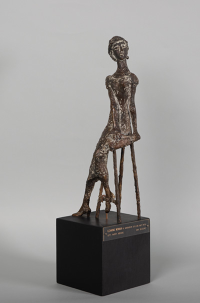
#layer-duo-1411
Marguerite Stix
(American, 1907–1975)
Leaning Woman
c. 1950s. Bronze
Gift of Harry Abrams
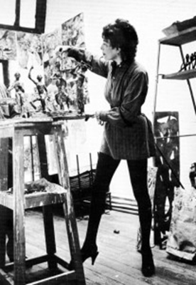
Perched with a ramrod straight spine on a stool, this seated bronze woman turns to actively cast a glance, weight on her left arm. She has a flickering surface and litheness that we might associate with Alberto Giacometti’s sculptures, yet there is a charm factor to this piece that doesn’t feel nervously existential the way Giacometti’s do. In fact, looking at the only photo I could find of Stix, we might say it’s a self-portrait. Like Leslie Caron in a leotard, Stix is arranging her sculptures in a cluttered studio. Her pixie hairdo, like her metal surfaces, is active, electrified by her mental energy.
As I looked into her scant bio, I’ve decided both things can be true. This can be a charming existentialist sculpture, because its creator had one foot in beauty and one in tragedy. Stix was born Margret Christine Salzer in Vienna, Austria, in 1907. Her Jewish family fled the Nazis in 1938, but while she caught the last train to Paris before the borders closed, the rest of her family perished in a concentration camp in Nazi-occupied Poland. In Paris, she found work making haute couture ceramic buttons and other small accessories for fashion houses such as Balenciaga and Schiaparelli.
She was eventually arrested and interned in a concentration camp at Gurs, where she was somehow still able to sketch, and upon release had a harrowing trek until she reached the United States. She met her husband, Hugh, when she brought her camp drawings to his Manhattan art gallery, and together they became a creative duet. She eventually fell in love with seashells, from which she began designing fashionable jewelry in 1963 to support her family. Most works by Stix in museums are, in fact, jewelry.
This sculpture entered our collection in 1959, and the record skipped when I saw the donor’s name — Harry Abrams. As in Harry N. Abrams, the art book publishing giant. The other works in our collection — two bronzes and four drawings — were donated shortly after Stix’s death. This sculpture is a good example of taking a second look and finding tenacity behind beauty, because if you have a second chance at life, you’d better enjoy it.
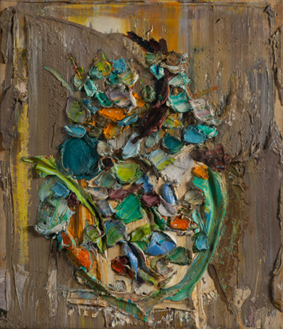
#layer-duo-1398
Manoucher Yektai
(American, 1921–2019)
Bowl of Flowers
1953
Oil on canvas
Gift of Dr. Fred Olsen
This small painting of a bowl of flowers is no shrinking violet. I chose it because I love paint that looks as yummy as frosting, and this is straight up birthday cake. And yet it hangs far back in the back of storage, encased in a weird shadow box frame like a bug specimen. Let’s give it some love this week.
Who is Manoucher Yektai? Thank you for asking. He was born and raised in Tehran, Iran, where he read the 13th-century mystical poet Rumi, known for whirling in circles while he meditated or composed poetry. Yektai moved to Paris in 1945 to study art when he was in his mid-20s, and there is something sweetly French about his choice of a still life with flowers. He then relocated to New York City in 1947 just as action painting was coming on the scene. Also known as gestural abstraction, there was a physical performance to this brand of painting — think Jackson Pollock’s flinging or dripping paint while walking around his canvas. Yektai was friends with painters such as Mark Rothko and Philip Guston and was exhibiting alongside the New York School when he made this painting in 1953.
Given the blend of cultural influences, this painting makes sense as a joyously physical being. Yektai applied his paint with a palette knife, and colors pick each other up and joyride together in a streak. There are quick short beats and long arcing curves, while paint moves in every direction across the surface of the canvas. Bits of woven fabric peek out from troweled gray-brown paint to say, "This is quite rapturously a painting.”
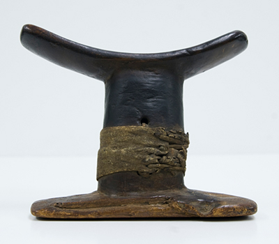
#layer-duo-1393
Anonymous
(Egyptian)
Headrest
New Kingdom; Second Intermediate Period (1650 – 1550 B.C.) to early Dynasty 18 (1550 – 1500 B.C.)
Wood and leather
Gift of Judi Todd
This ancient Egyptian headrest has a straightforward ease about it, and I was surprised at how small and dainty it is in person. While many Egyptian headrests were elaborately decorated with apotropaic images to protect the sleeper, this one has the simple warmth of a Danish modern chair — softly rounded wood equals human comfort. In hot climates such as Egypt’s, these bolsters allow for air circulation around the head and shoulders. They also protect elaborate hairstyles. It is such a good, portable design that headrests are still used in many parts of Africa today, making it one of the most long-lasting, unifying designs throughout the continent.
I always imagined that one would lay the back of the head on a headrest the same way I struggle in a dentist’s chair to find the right spot that would be both comfortable and elevate my head. While that is one possible position, these were best meant for side sleeping. The height of the headrest should equate to the length of the shoulder when one lies on one’s side, keeping everything in alignment.
Ancient Egyptians believed the soul was transported beyond the body while asleep and could talk to the gods or to the dead through dreams. They even had sleep temples as a form of healing. In other words, they had a beautifully fluid concept of the self and its limits that I find really appealing, and that make this object more complicated than it first appears.
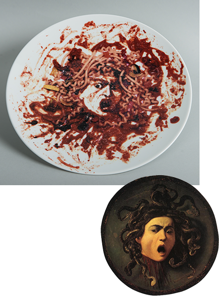
#layer-duo-1378
Vik Muniz
(Brazilian, born 1961)
Untitled (Medusa Plate)
1999
Ceramic
Gift of the Peter Norton Family
This week’s object lets us have a little fun while dipping a piece of mental bread into the work to sop up some serious art history. Here, Brazilian artist Vik Muniz tackles a grandiose subject: He has recreated the head of Medusa, the mythological gorgon with hair of writhing snakes (seen here in noodles), whose gaze was said to turn men to stone. But this isn’t just any Medusa — the artist has recreated famed Baroque artist Caravaggio’s Medusa from 1598. Painted on canvas, it was then mounted to a circular piece of wood to resemble the reflective shield that Perseus used to turn the gorgon’s gaze back upon herself. The screaming image forever captures the existential moment of her horror as well as death by decapitation. Like Caravaggio, Muniz shows us the moment of suspended life and death. Out of spaghetti and red sauce. On a plate.
Muniz had already created a massive version of Caravaggio’s Medusa with junk scavenged from a Rio de Janeiro junkyard, an assemblage that was then aerially photographed. But perhaps this simple round plate, with the remains of an Italian meal, better reflects the spirit of the original painting. There is a fine line between marinara sauce and horror. (I once dropped a jar on my kitchen floor.)
This Limoges plate with image transfer is a limited edition artwork. Every year since 1988, art collector and Museum of Modern Art trustee Peter Norton commissions an artist to make an editioned piece, and these are then mailed to friends and art institutions at the holidays. We received ours in the mail in 1999. Thanks, Peter!
#layer-duo-1339
Kyohei Inukai
(American, 1913–1985)
T.R.F. VII
1970
Screen print on paper
Gift of Maurice Cunniffe
Friends, I startled even myself with a lost treasure this week. I swear it felt like falling in love on a Friday afternoon. I was flipping pages of a report on collection objects, a way of quickly skimming over things buried in drawers or locked in cabinets without having to wear gloves and disturb them. A name suddenly stopped me — Kyohei Inukai. Who is that? And what are those? Four screen prints (one shown here) that are so joyous and playful that I couldn’t believe what I was seeing. These have the rigor of Josef Albers color studies or Bauhaus design experiments and just a touch of the 1970s PBS logo thrown in for good measure — you know, the one that had movement and music, and the ‘P’ was a person’s head. In other words, geometric design on a human level, not a classically cold one. And these are big — over three feet on each side — so a grid of all four would be amazing.
These have been buried in our storage since the 1970s, but this artist also seems to have been lost to art history. It took some serious doing to figure out he wasn’t his father, Kyohei Inukai, a turn-of-the-century realist portrait painter whose first wife was Lucene Goodenow, a fellow student at the Art Institute of Chicago. The artist of our four prints was born Earle Goodenow in 1913 and later took his father’s name. That means he was not, as I had hoped, the love child of Ellsworth Kelly and op artist Bridget Riley. Whatever… just look at those colors!
#layer-duo-1336
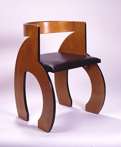
Gerald Summers
(1899-1967) Designer
Makers of Simple Furniture (1931-1940) Manufacturer
CB Chair
designed 1933, this example c. 1935
Laminated wood, plastic coated fabric upholstery (original)
This chair is a rare gem, made by a former World War I soldier and carpenter, and it makes me grateful for the curiously intrepid curators that sat at my desk before me. (I’m looking at you, Kevin Tucker.) When I first saw this chair in storage, it was like encountering a 3D character in a foreign language. Pixyish in size, the CB, or Curved Back, Chair tucks neatly into the keyhole of a desk or under a dining table. Follow the line from its backrest down to the deer-like feet and you see how designer Gerald Summers would form an entire chair out of a single sheet of wood. His favorite material was airplane plywood, and World War II’s material thirst shut his work down in 1940.
A British Modernist, Summers has been shrouded in London fog while Alvar Aalto and Charles and Ray Eames became designer celebrities for their bent plywood furniture. Summers’ champion has been the decorative arts historian Martha Deese, who in 1985 sent a letter to every G. Summers in the London phone book. She got a reply from Marjorie Amy Butcher, Summers’ widow and partner in Makers of Simple Furniture, the firm they started together in 1931. Butcher still had much of the company’s materials, and Deese was able to reconstruct its decade-long history in her 1989 Master’s thesis. Her new book on the subject, Shaped for Purpose, just appeared in 2020. Now that’s a beautifully ongoing romance.
#layer-duo-1279
Anonymous
(17th-century English or Colonial American)
Dutch Gentleman with Van Dyck Beard
c. early 17th century
Oil on wooden panel
Bequest of Flora McIver Barringer
This wallflower of a painting has been languishing in storage for decades. The problem is partially that we don’t know who this gentleman is other than a generic Dutch man with what someone once misnamed a Van Dyck beard (a true Van Dyck has shaved cheeks). We think the artist was working either in England or New England, but we don’t know which. With so many questions, sometimes it’s hard to justify putting a painting on view when there may be a "better" or just better understood example on hand. So there he patiently waits, a dewy light in his eyes, warm skin, soft bangs brushed back with hipster devil-may-care, and those delicate shadows near his temple that feel almost miraculously real.
I looked into things a bit and learned something that may or may not be relevant to the situation. In 17th-century England and New England, there were two styles and two modes of thought around portraits. A highly illusionistic, Anglo-Dutch style meant that a person’s character was malleable, subject to the whims of circumstance like the momentary shadows on their face. A more linear, ornamental, "neo-medieval" depiction, on the other hand, meant the sitter had the timeless attributes of inherent authority going back centuries. The first category of portraiture, in effect, suggested that an individual might compete against a static, traditional hierarchy by using his cunning and reason. So our mystery man is not only interesting, he may just be a rabble-rouser.

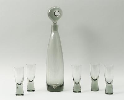
#layer-duo-1262
Per Lütken
(Danish, 1916–1998) (designer)
Holmegaard, Danish
(Danish, founded 1825) (manufacturer)
“Aristokrat” Decanter and Canada Schnapps Glasses (set of 5)
c. 1955
Smoky gray crystal
Gift of Jessica Kross and museum purchase
In the spirit of togetherness, this week’s object spotlight is a grouping of 1950s Danish modern glassware designed by Per Lütken — a drink set that is glamorously domestic. The glasses were offered as a gift to the museum in 2018, and I searched for the perfect example of a decanter to be the bishop to their sweet little pawns. After shopping online, comparing air bubbles and swirl personalities, I found our mint condition vintage decanter.
The balance of lightness and weight in these pieces is like a smoky gray poem. Lütken was a master glass designer and it’s hard to imagine, but these commercially sold wares were all mouth blown. When he designed pieces that proved challenging to his glass blowers, Lütken’s famous reply was, "Well, who said things were supposed to be easy?"
#layer-duo-1254
Lorna Simpson
American, born 1960
Cure/Heal
1992
Part of "10: Artist As Catalyst; A Portfolio to Benefit the Alternative Museum"
Screen print in colors
Museum purchase with funds partially provided by Admiral and Mrs. Cato D. Glover
Lorna Simpson left the door onto this image open in 1992, and I think now is the perfect time for us to walk through it together. Her conceptual photographs are like kaleidoscopes — their fragments are meant to be tilted, reordered, and reinterpreted — because none of us are monolithic in our experiences. Instead, she drops loaded clues about racial and gender stereotypes for us to pick up and discuss.
Because it has no one fixed meaning, this unhappily seductive image may be the postcard for this pandemic experience. At first glance, it might signify a version of yourself that used to get dressed up for work — someone you barely remember right now as you sit there in your softest clothing, trying to remember what day it is.
Those velvet heels also eerily feel like someone was just standing in them. This might be the absence of someone you lost or someone you miss seeing with all of their full molecular weight. The title Cure/Heal also proclaims the need to find a way out of this situation in a laboratory somewhere, by someone, soon. And finally, because Simpson’s work addresses the African American experience, the image acknowledges the imbalance in the way this illness has affected us as a blended family.
Simpson donated this screen print to be compiled in a portfolio of ten artists’ prints that raised funds for the Alternative Museum in New York City. With some help, the CMA bought one at the time. Founded in 1975, the Alternative Museum was a grassroots, artist-led institution that aimed to be inclusive and address social issues through exhibitions, world music concerts, performances, and panel discussions. It closed its heavy doors in April 2000 and has lived as a virtual museum and archive ever since. As the CMA, and all museums around the world, reach out to meet you where you are, the Alternative Museum feels like a friend, branding itself as a "global electronic city…sharing our cultural treasures."

#layer-duo-1226
John Koch
American, 1909 - 1978
Painter and Models
1972
Oil on canvas
Museum purchase
Whenever I pull the sliding rack in storage and this painting hits me in the eye, well, what can I do but giggle — but not for the reasons you might think. I mean, that female model is on the phone! And it’s one of those great rotary dial phones, too, because it’s the 1970s. Look at how absorbed these people are in what they’re doing. It feels creepy because these people have actual attention spans.
I always wonder what to do with this because it’s so unlike the rest of our contemporary collection. This scene is about an artist at work in a traditional way, painting nudes with no irony. That woman at the left could be Titian’s Danaë, but rather than a shower of gold raining down, she is magically connected through AT&T. The male model is none other than the ancient Greek Doryphorous, the endlessly copied sculpture of ideal male proportions. Art historians love that shift in weight to one leg because it shows a moment of humanness and sets off a cavalcade of little asymmetrical reactions in the body.
So with this painting, enjoy a moment to contemplate a complete lack of social distancing, but also the joy of slowing down and working with no pants on.
#layer-duo-1221
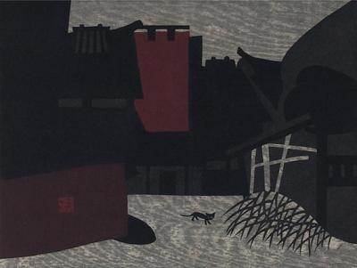
Kiyoshi Saito
Japanese, 1907-1997
Ancient City, Nara
1957
Color woodblock print
Museum purchase
I was looking for something else when this stunner of a print completely arrested me. It is both ancient and modern at the same time. This is also an example of when an artwork just feels right. It is completely balanced while keeping you slightly off balance examining all of its devices. Exhibit A — the way that wood grain creates both a cloud-streaked sky and the wheel-tracked road.
Kiyoshi Saito was part of the Sosaku Hanga (“creative print”) movement that spawned a new wave of Japanese printmaking, away from the commercial 19th-century woodblock prints made en masse for the entertainment industry. The Sosaku Hanga artists’ hands were on every step of the creative process, and prints appeared in limited numbers. Global influences, particularly the European avant-garde, were creeping in, but it was just as much about the Western notion of "art for art’s sake."
The CMA scored a bullseye with this print because we had the foresight to purchase it in 1957, the year it was created. It also reminds me of how quiet and empty areas of our own city are right now, with animals feeling free to roam. And it doesn’t get any cooler, frankly, than that hep cat.
#layer-duo-1212
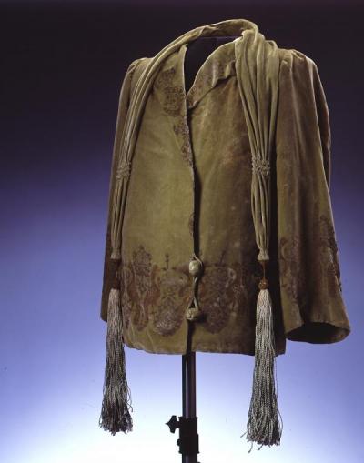
Maria Monaci Gallenga (designer); Atelier Gallenga (manufacturer)
Jacket
c. 1920s
Velvet and silk
Gift of Mrs. Margaret H. Lloyd
To know me is to know that I giddily love 20th-century fashion. I used to think that was somehow embarrassingly decadent until I started studying fashion as part of the same social and economic envelope as fine art, and now I argue for its importance on a regular basis. When I saw that we have a few terrific pieces of flapper-era fashion in storage, I was over the moon. Maybe you’ve seen the beautiful Mariano Fortuny velvet jacket on view on in our gallery of light-sensitive materials. I’m the little elf responsible for choosing that piece.
Now I get to introduce you to another designer, Maria Monaci Gallenga, working in Italy at the same time as Fortuny and in a similar way, but making her own contributions to the science and art of printed velvets. Like Fortuny’s, Gallenga’s designs evoke Gothic and medieval motifs and sometimes even styles, although our short jacket feels like a chic little 1920s piece with global influences. Gallenga is known for using up to nine different tones of gold and silver in a single garment. I recently saw some of the artist’s designs in an exhibition at the Metropolitan Museum of Art, and they (and I) glowed.
#layer-duo-1213
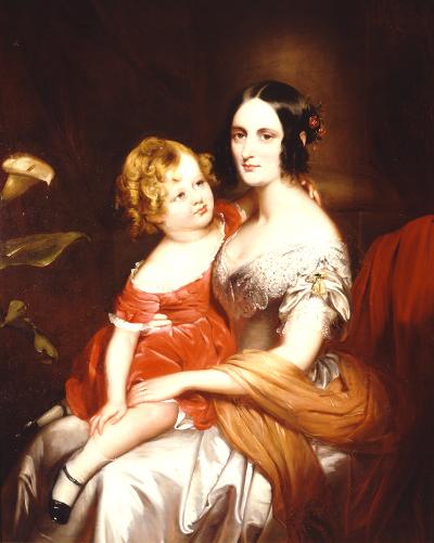
Sir William Gush
(English, 1813–1888)
Mrs. Fry and Son
c. 1847
Oil on canvas
Gift of Charles M. Hofman
I love portraits. Especially if there are some great fabrics involved, like silks and satins that allow oil paint to really bask in its own velvety, glossy goodness.
Before the museum shut its doors, I had been spending considerable time pulling racks of paintings in storage and thinking about what needed some love and attention. Exhibited at London’s Royal Academy of Art in 1847, this portrait of a mother and son kept haunting me. It has a satisfyingly warm, ruddy glow and intimacy, but there is also a coolness in the mother’s dignified expression that matches the temperature of her icy-colored silk gown. The crackle of warm and cool kept me coming back.
On the left, the Calla lily is hilariously horning its way into the picture so intentionally that it made me go read up on Victorian-era "floriography.’" This is the language of flowers used to speak secret messages when Victorians kept everything pretty well under wraps. Lilies in general call up the Virgin Mary’s purity, but I also found a discreet mention that for Victorian aesthetes, Calla lilies meant simply "precious loveliness." I’m going with that.